4 min
Redesigning the discovery index for market research
TC is one of Brazil's largest financial platforms. Millions of traders use it daily to access market research from top brokerages — BTG Pactual, XP, Genial, Eleven, and others. The Reports section was where all that research lived. And it was broken.
1. Problems
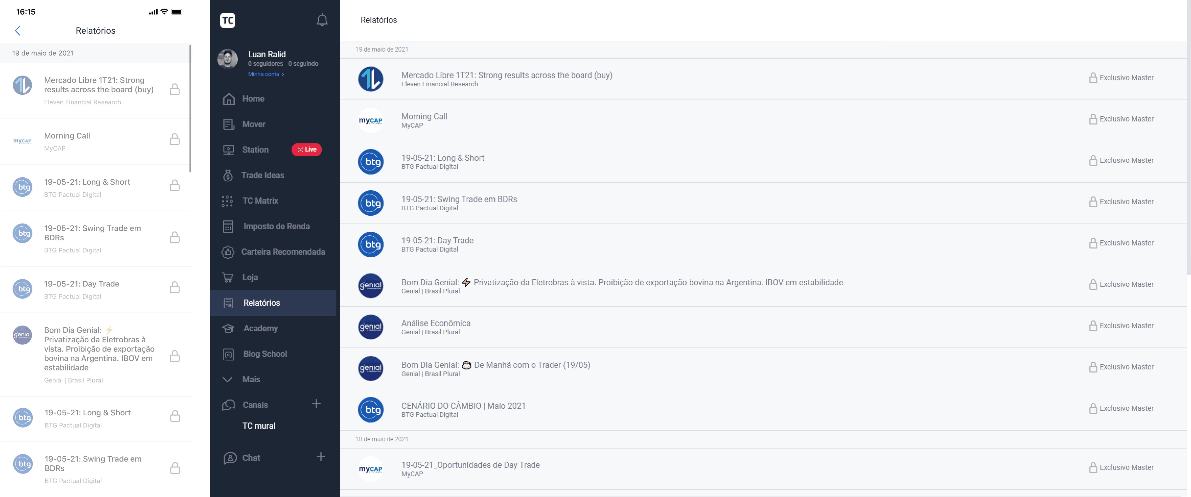
Reports were dumped into a chronological feed. No search. No filters. No way to tell yesterday's analysis from last month's. Users scrolled endlessly through content that wasn't relevant to them. The design system components underneath were outdated and untokenized — making any iteration slow before it even started.
2. Existing filter component
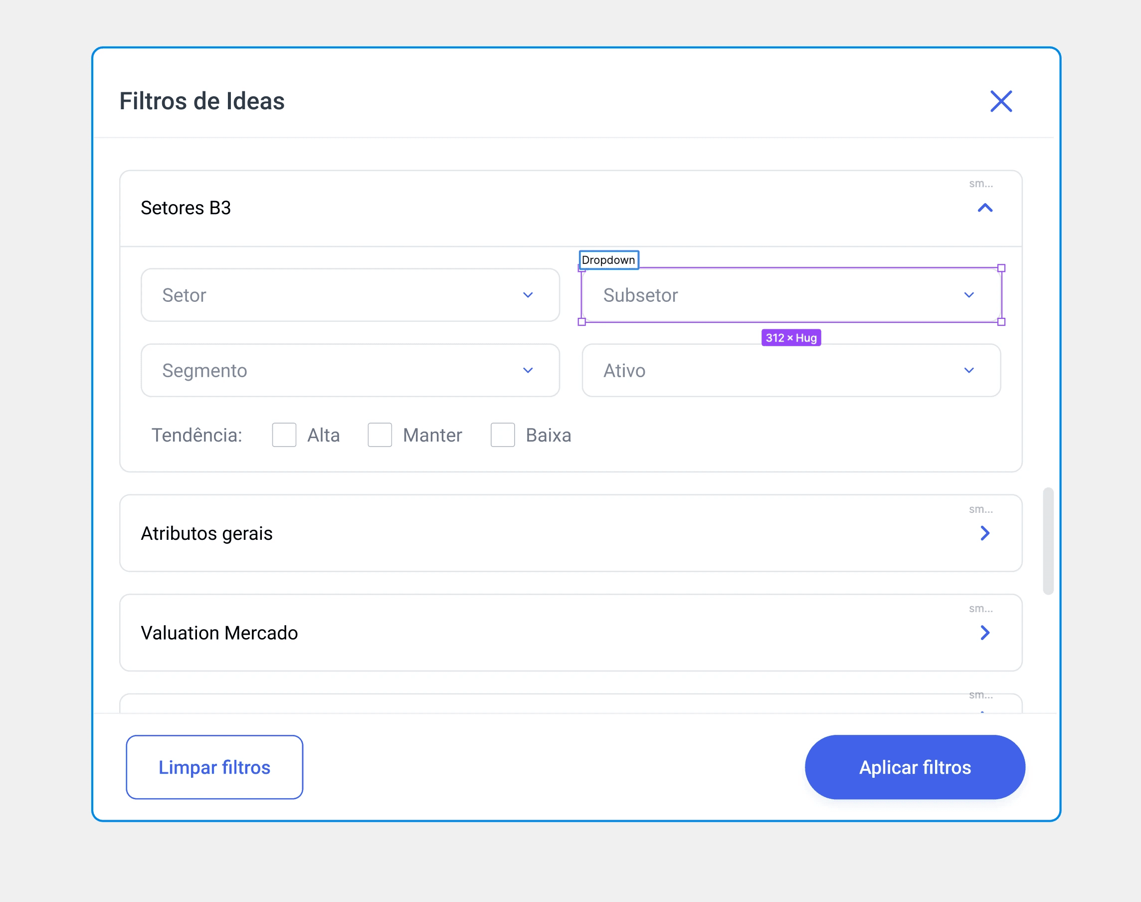
The platform already had a filter — a modal with nested accordions used in other sections like Trade Ideas. It couldn't be applied to Reports. Different data model, untokenized components, no path to adaptation. We needed to start over.
3. First iterations
Early explorations surfaced filters directly in the content area. The panel consumed a small portion of the viewport, forcing cramped multi-column layouts. No responsive strategy. It broke on smaller screens. But it validated one thing: filters needed to live inline, not in a modal.
4. Second version
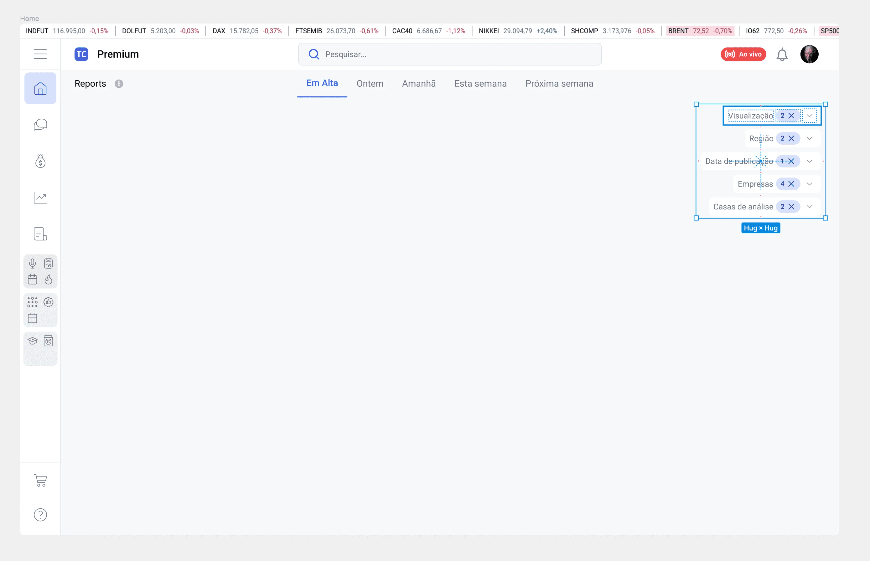
The next pass went minimal — a row of collapsed dropdowns showing active filter counts. Clean surface, but too hidden. Users had to click every dropdown to understand what was available. In financial tools, people need to see their options, not hunt for them. Minimalism without progressive disclosure is just obscurity.
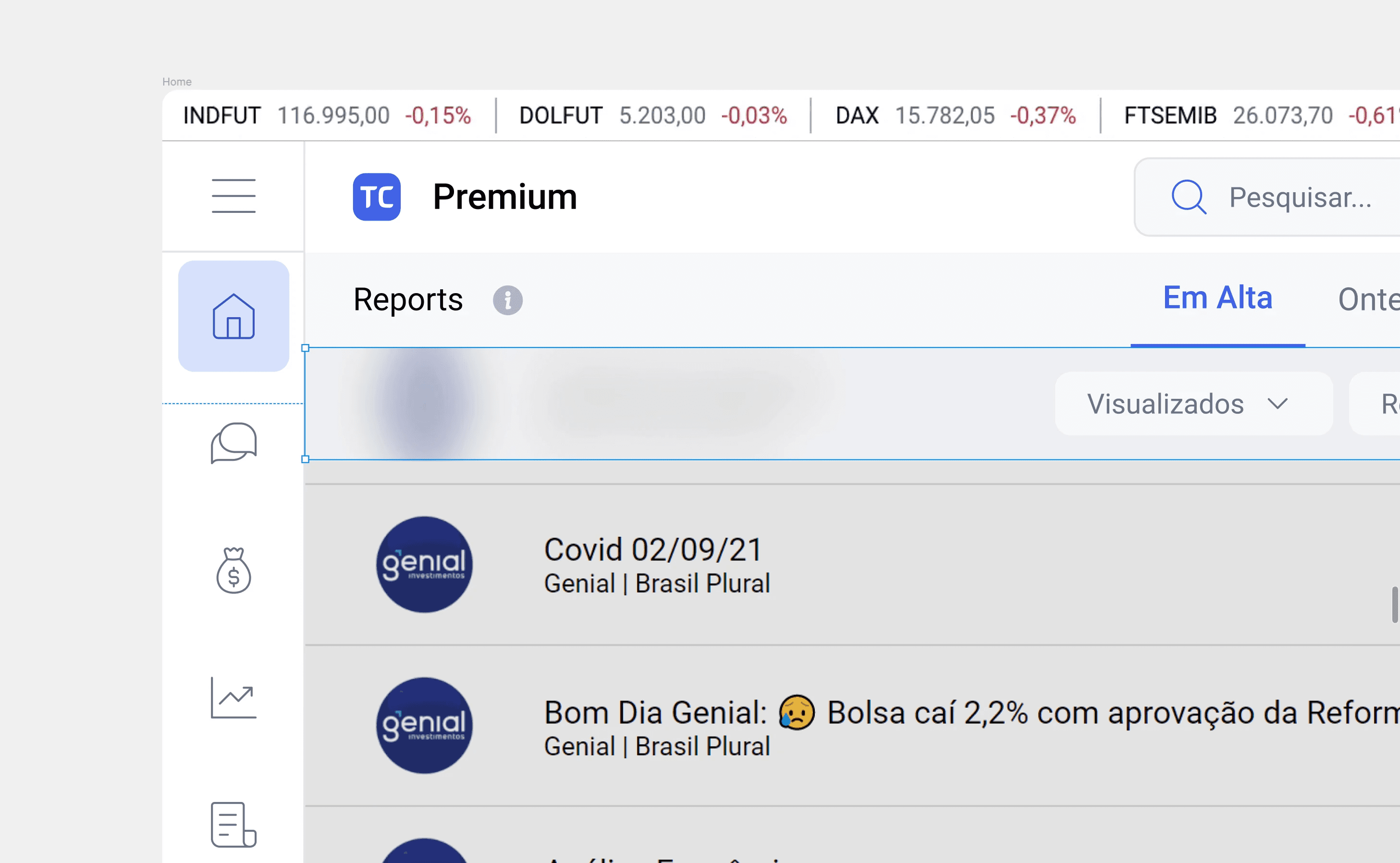
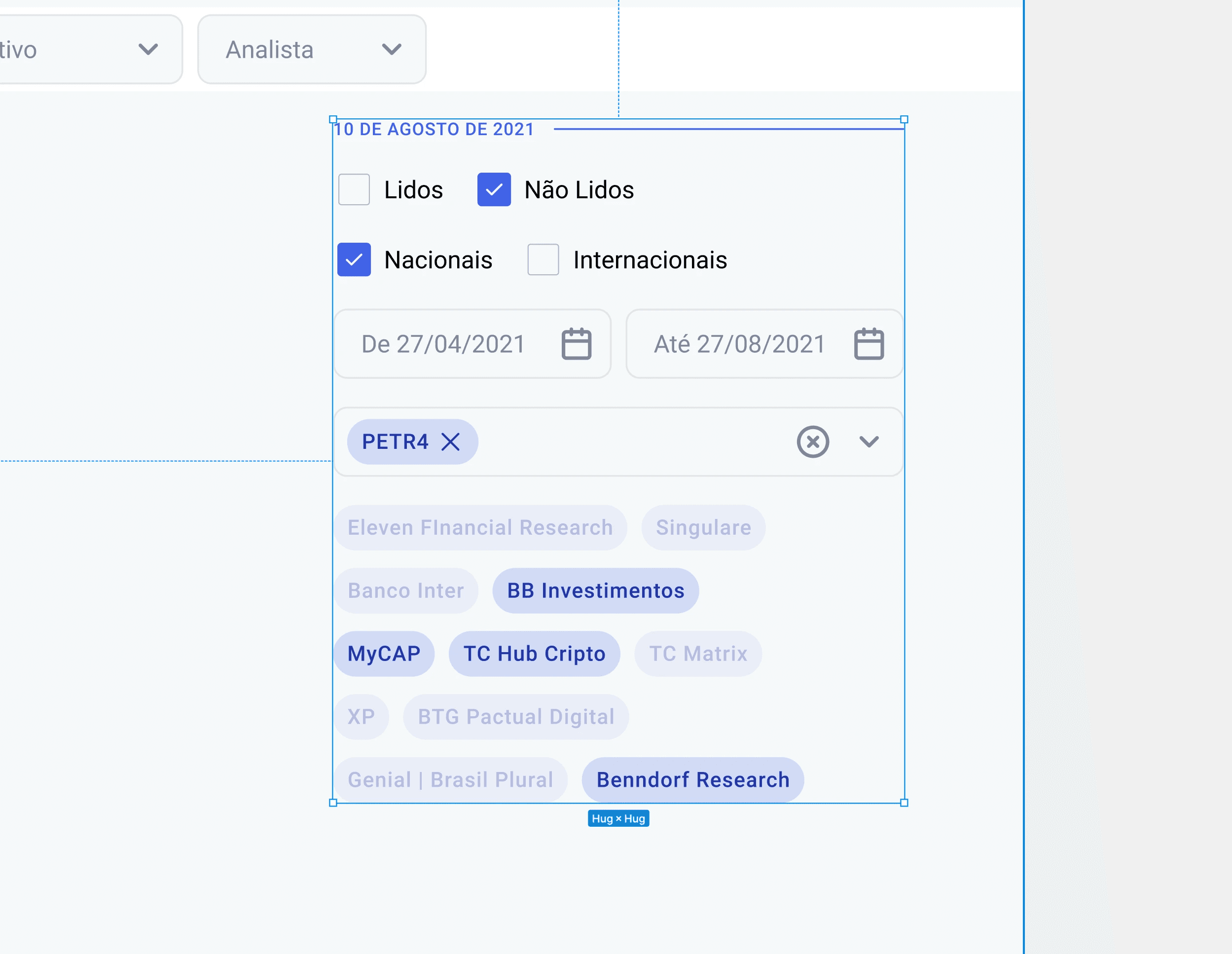
5. Fixed filter island
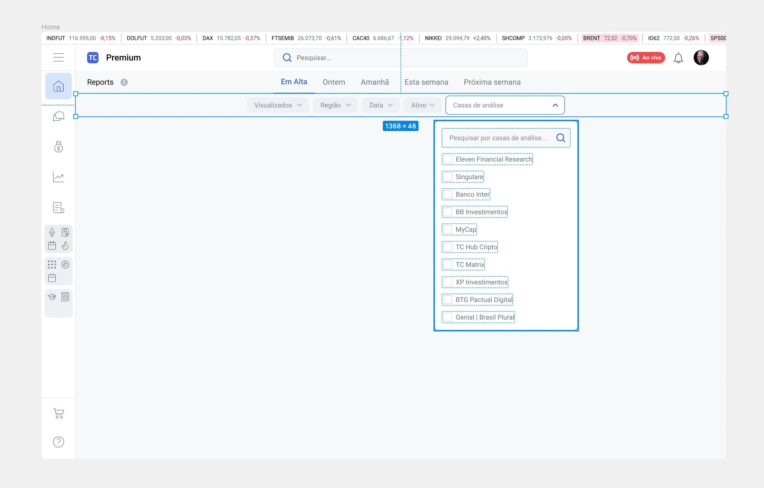
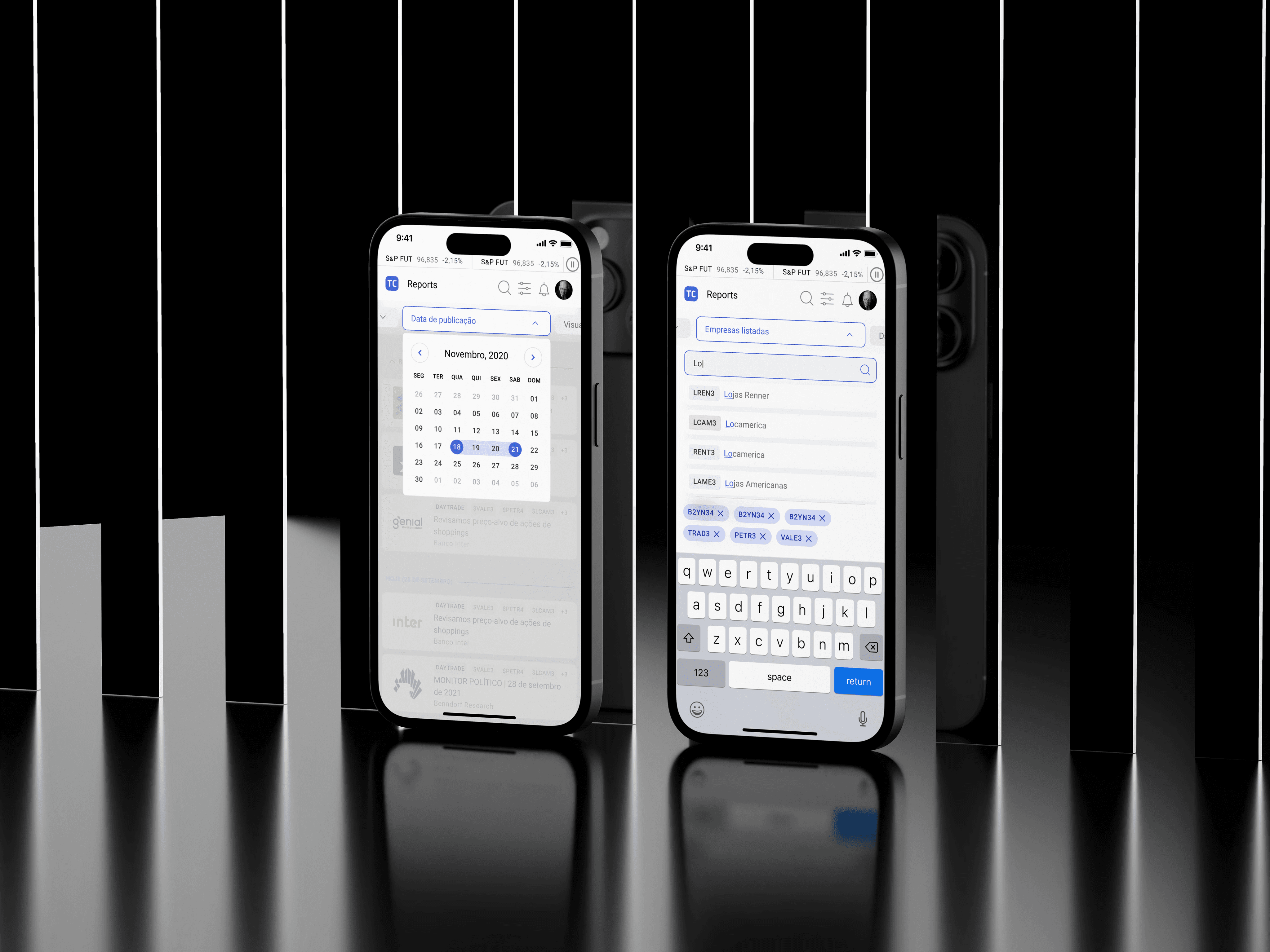
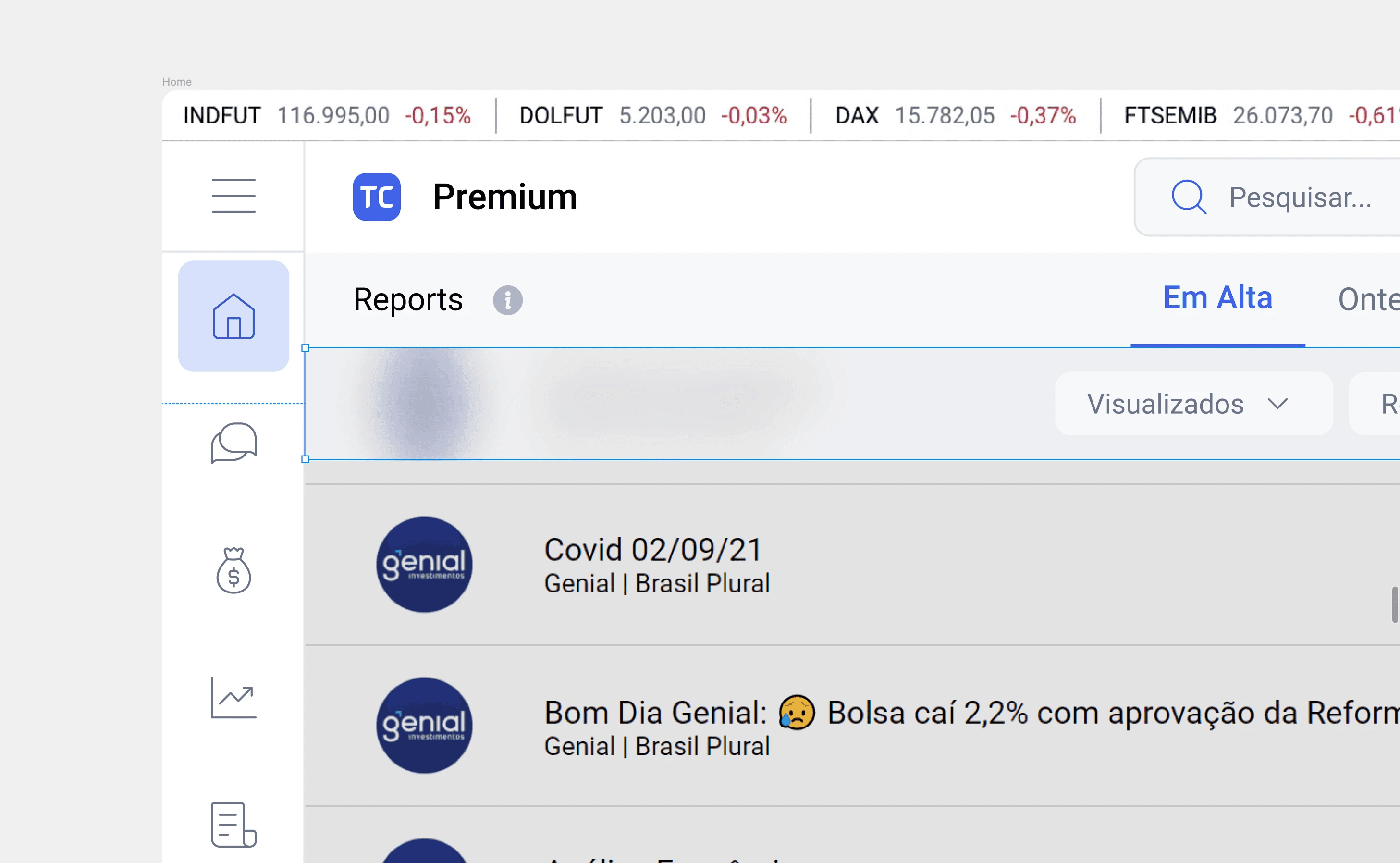
The breakthrough. A persistent horizontal bar anchored below navigation, always visible while scrolling. Each pill expands inline — searchable lists, multi-select chips, date pickers — without leaving the page. It worked because it respected two competing needs: density for power users, clarity for everyone else. Mobile-friendly by default — the horizontal pills naturally become a scrollable row.
6. Evolving components
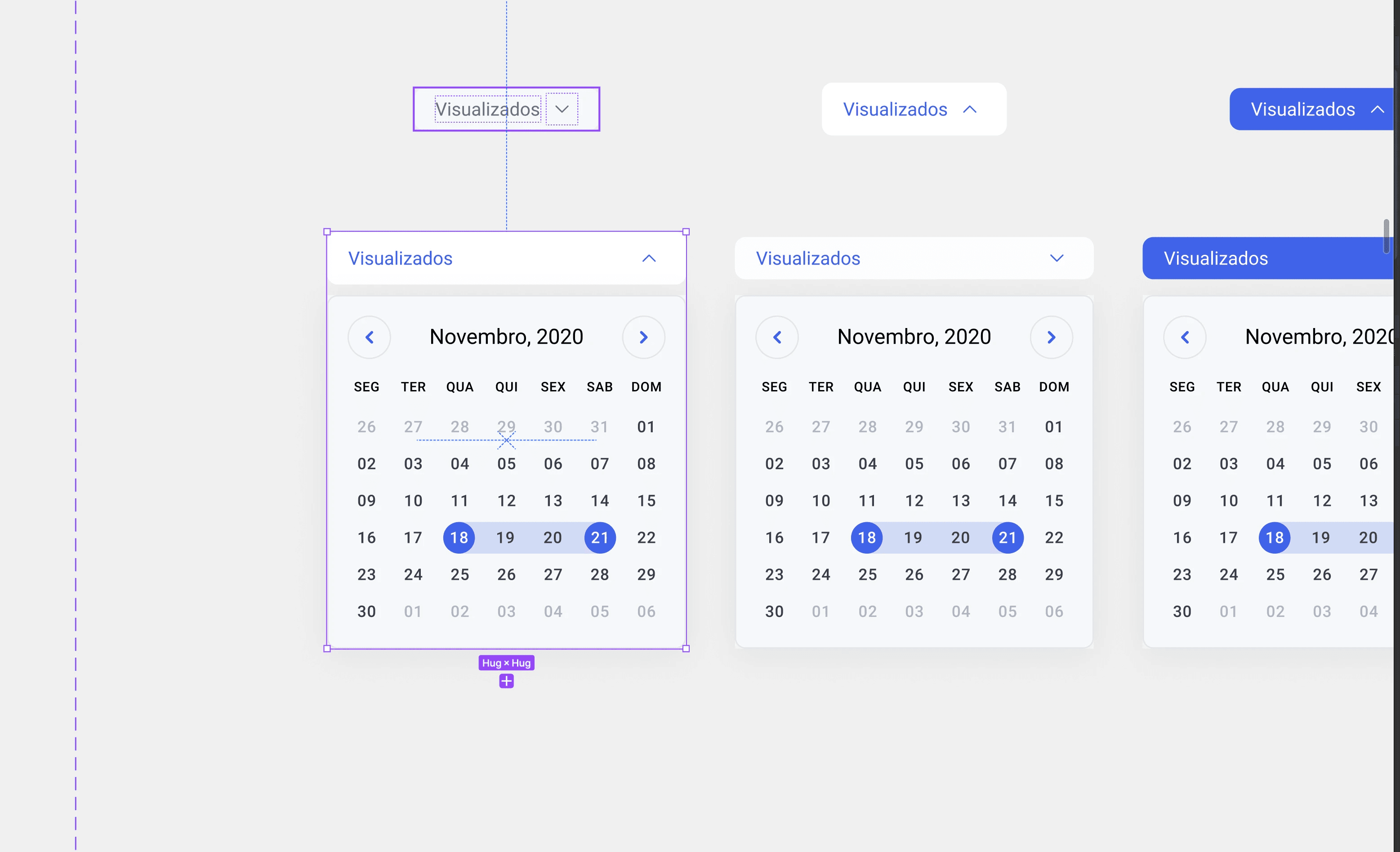
The filter island forced a reckoning with the design system. Dropdowns, calendars, checkboxes — all rebuilt with proper tokens, variants, and states. Every component contributed back to the shared library. What started as a filter project became a system-wide upgrade.
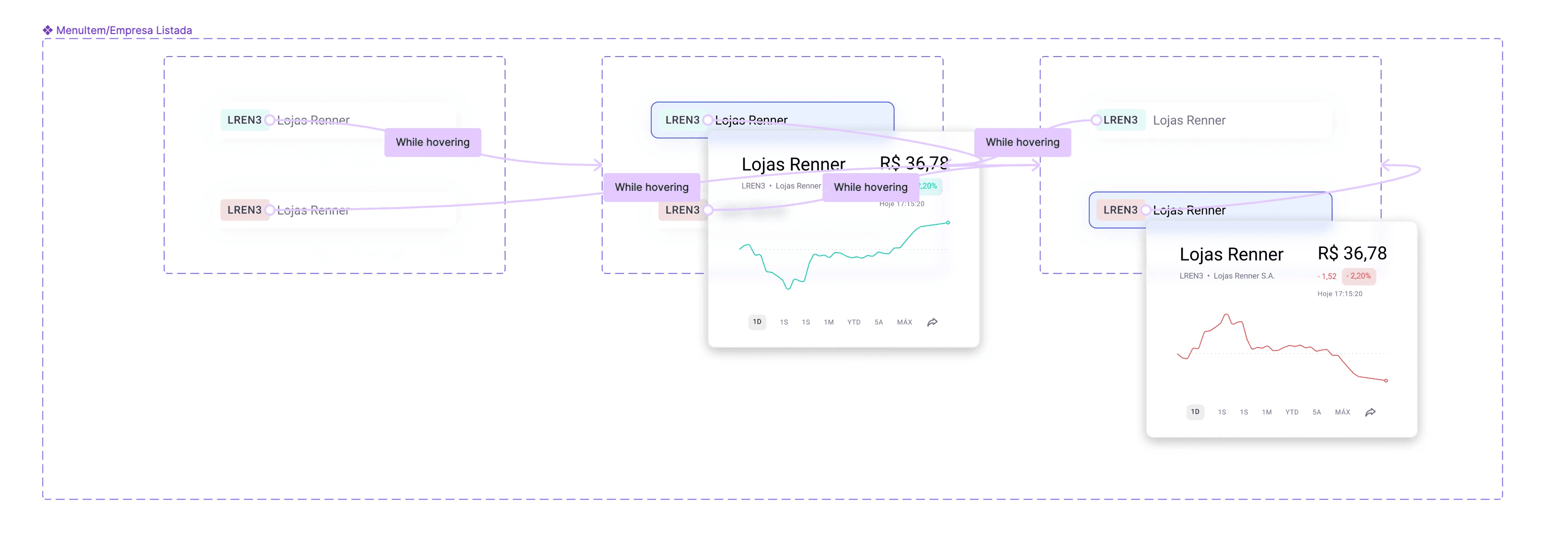
7. Dynamic information
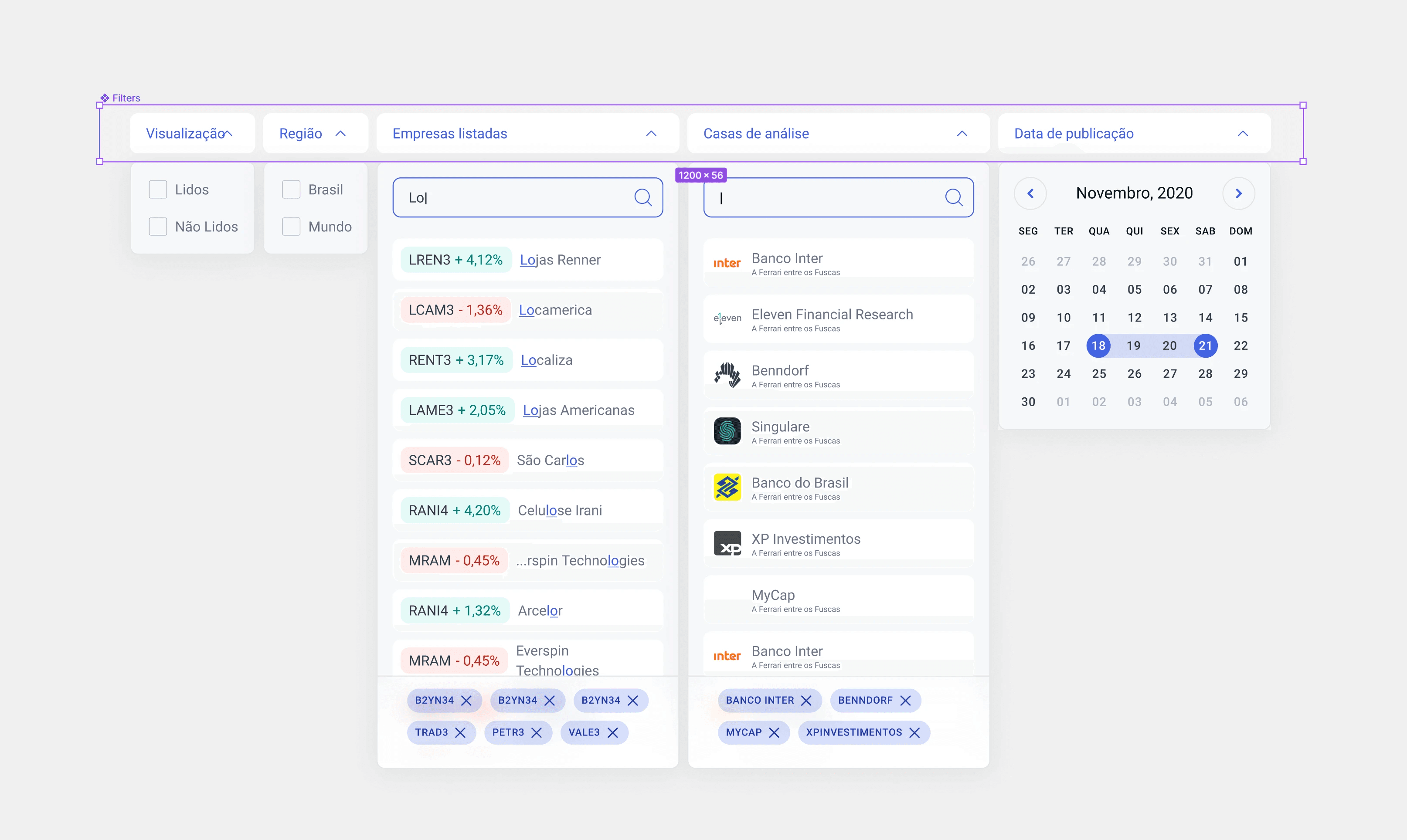
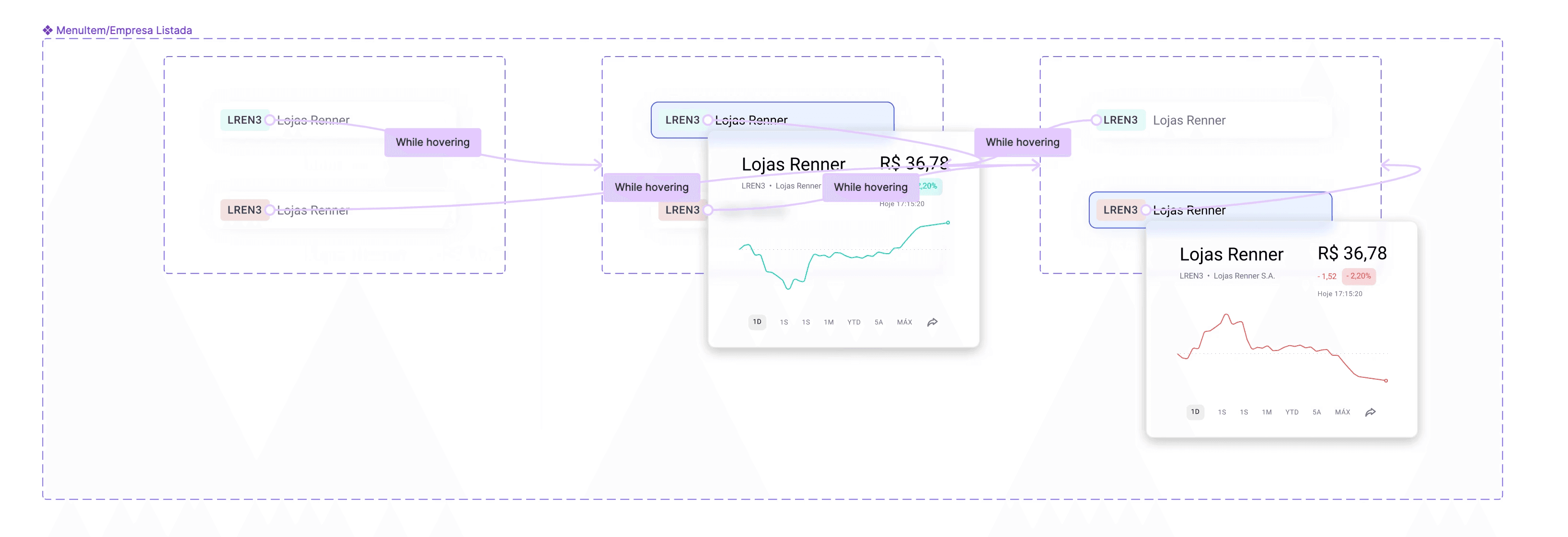
The polished filter island introduced context-rich content inside dropdowns. Typing a ticker shows real-time price movement alongside results. The brokerage selector displays logos and descriptions. Selected filters appear as removable chips, giving clear feedback without leaving the panel. Users get market context while they search.
8. Background Blur
When a dropdown expands, the feed behind it blurs. Subtle, zero performance cost, but it focuses attention without breaking spatial awareness. A small CSS detail that made the interaction feel intentional.
9. Mobile options
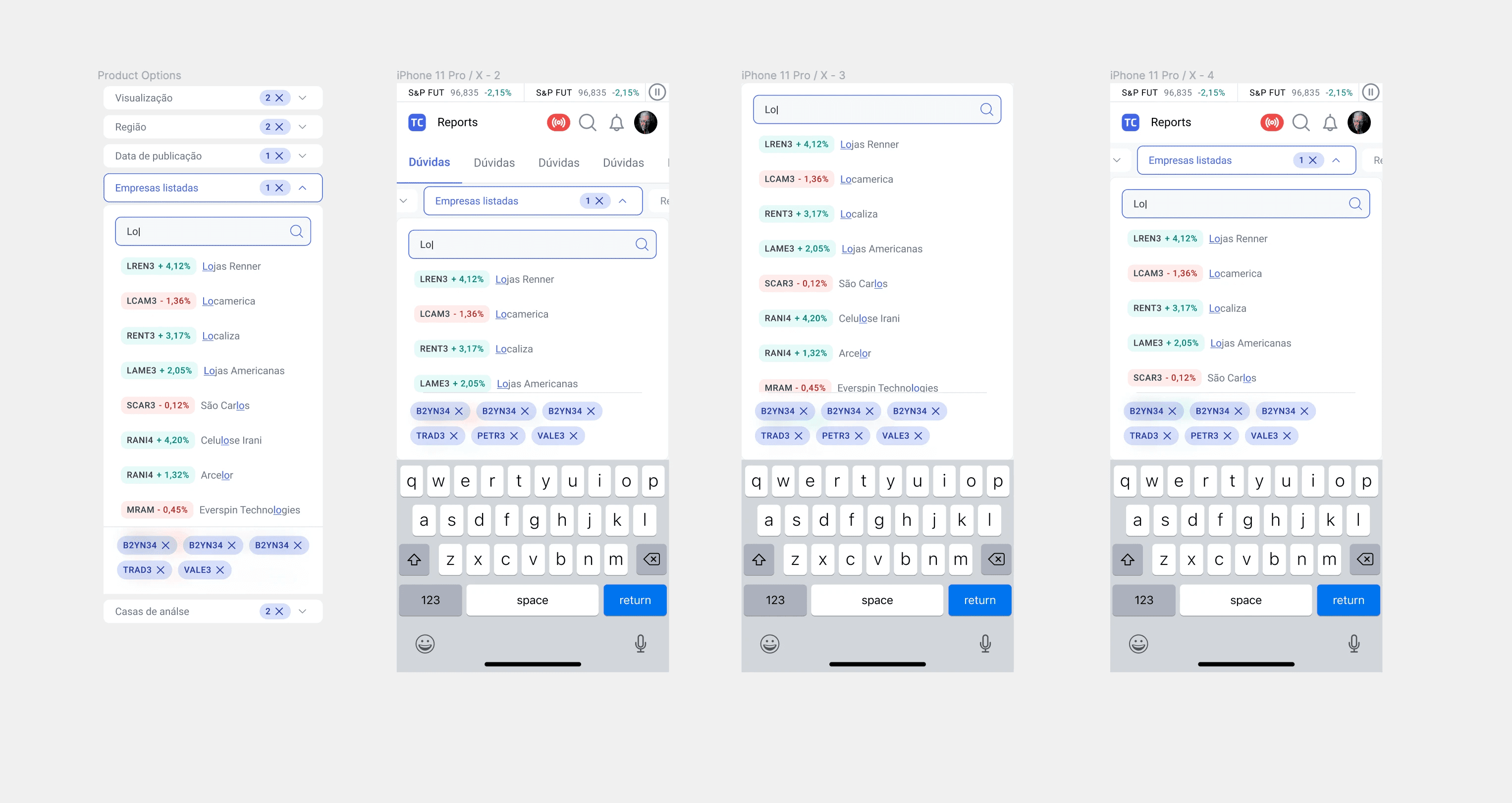
Four approaches prototyped. Stacked dropdowns — too much vertical space. Full-width expansion — keyboard overlap. Persistent pills with inline panels — better, but chip visibility suffered. The shipped version: horizontally scrollable pill bar, focused search panels that respect keyboard height, selected chips always visible. Touch-first, not touch-adapted.
10. Enhanced Design System
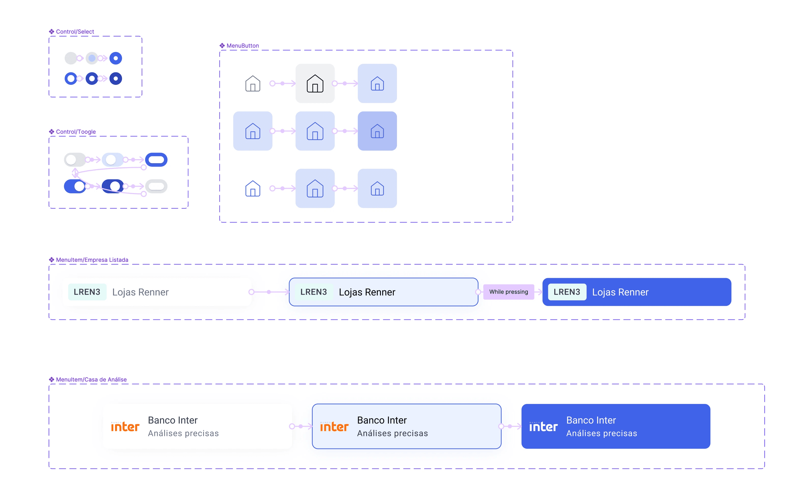
The project catalyzed a broader system overhaul. Stock list items with hover states and mini price charts. Radio buttons, toggles, and checkboxes with full state coverage. Navigation icons with consistent active/inactive treatment. All built with Figma variants and auto-layout, mapped 1:1 to frontend specs.
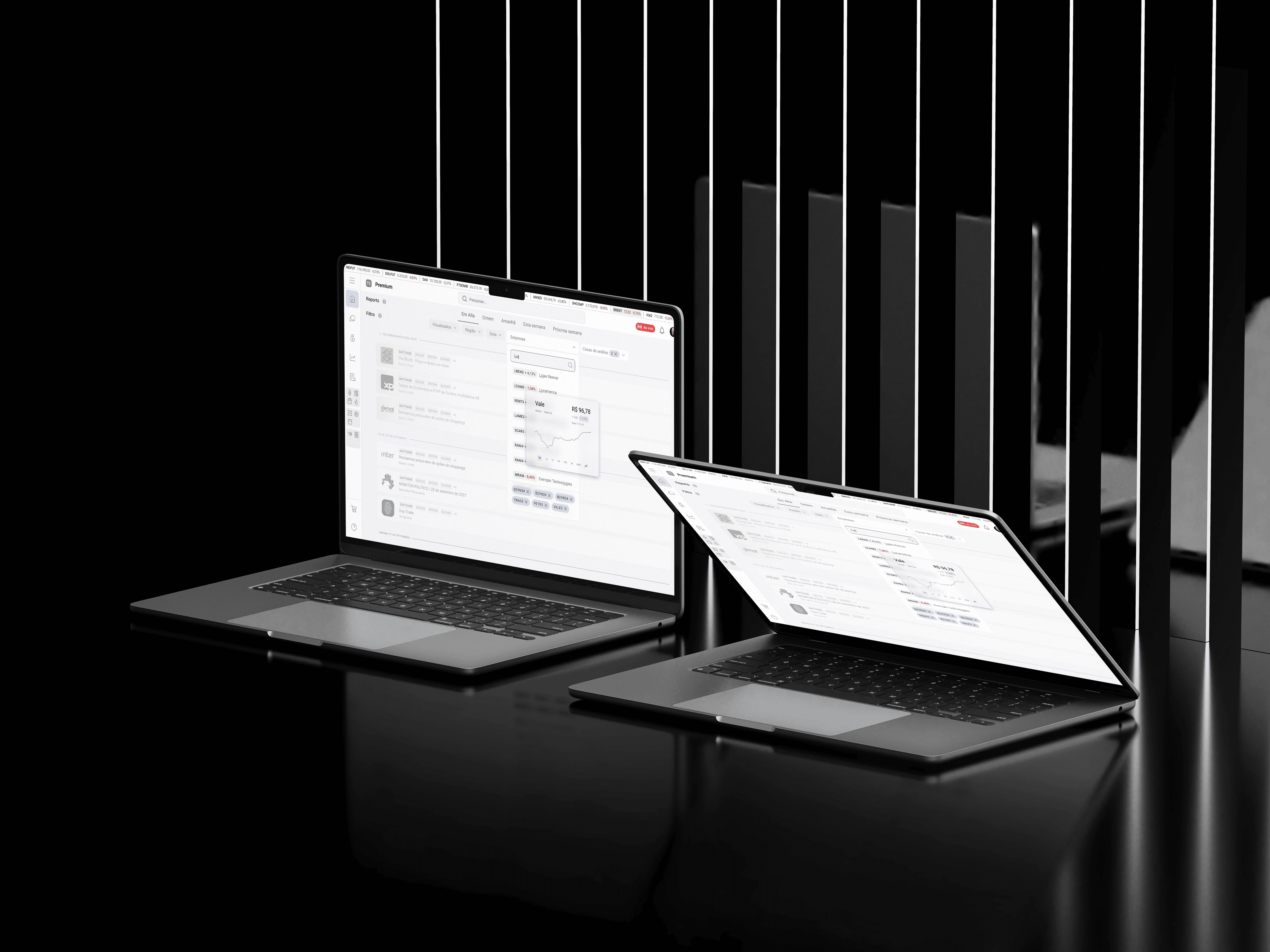
12. Prototypes
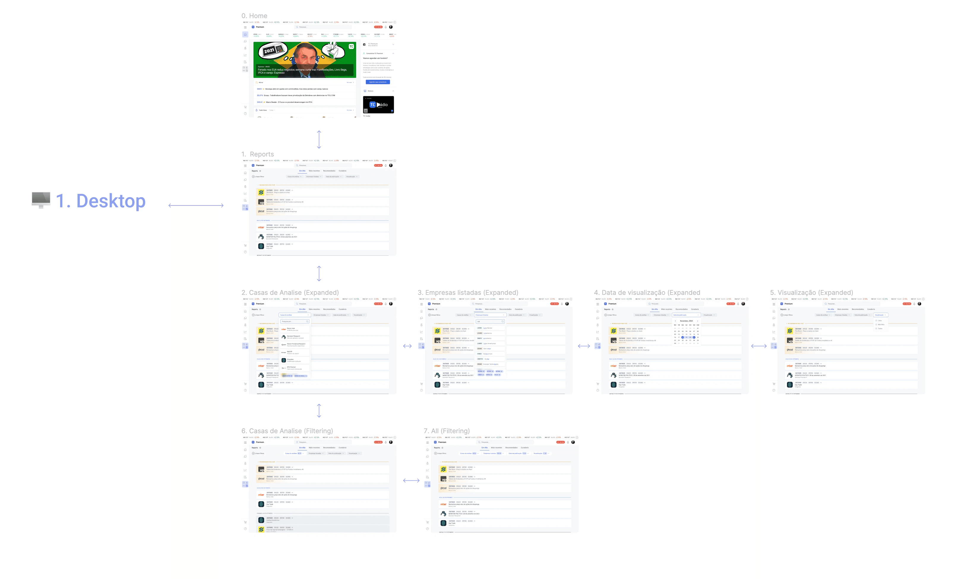
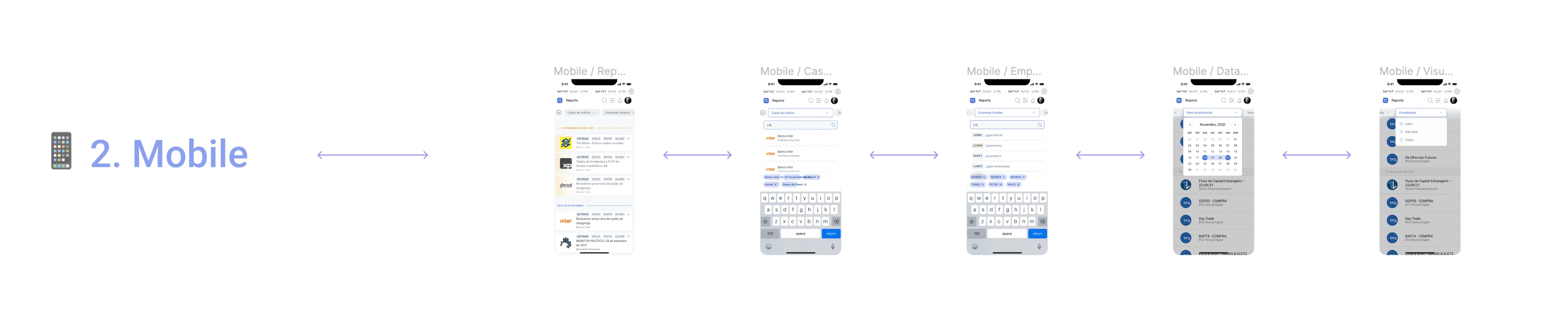
End-to-end interactive prototypes for both platforms. Desktop: 7 screens covering Home → Reports → every filter state and combination. Mobile: 5 screens optimized for touch and keyboard coexistence. Validated internally and with a subset of TC Premium users.
13. Release

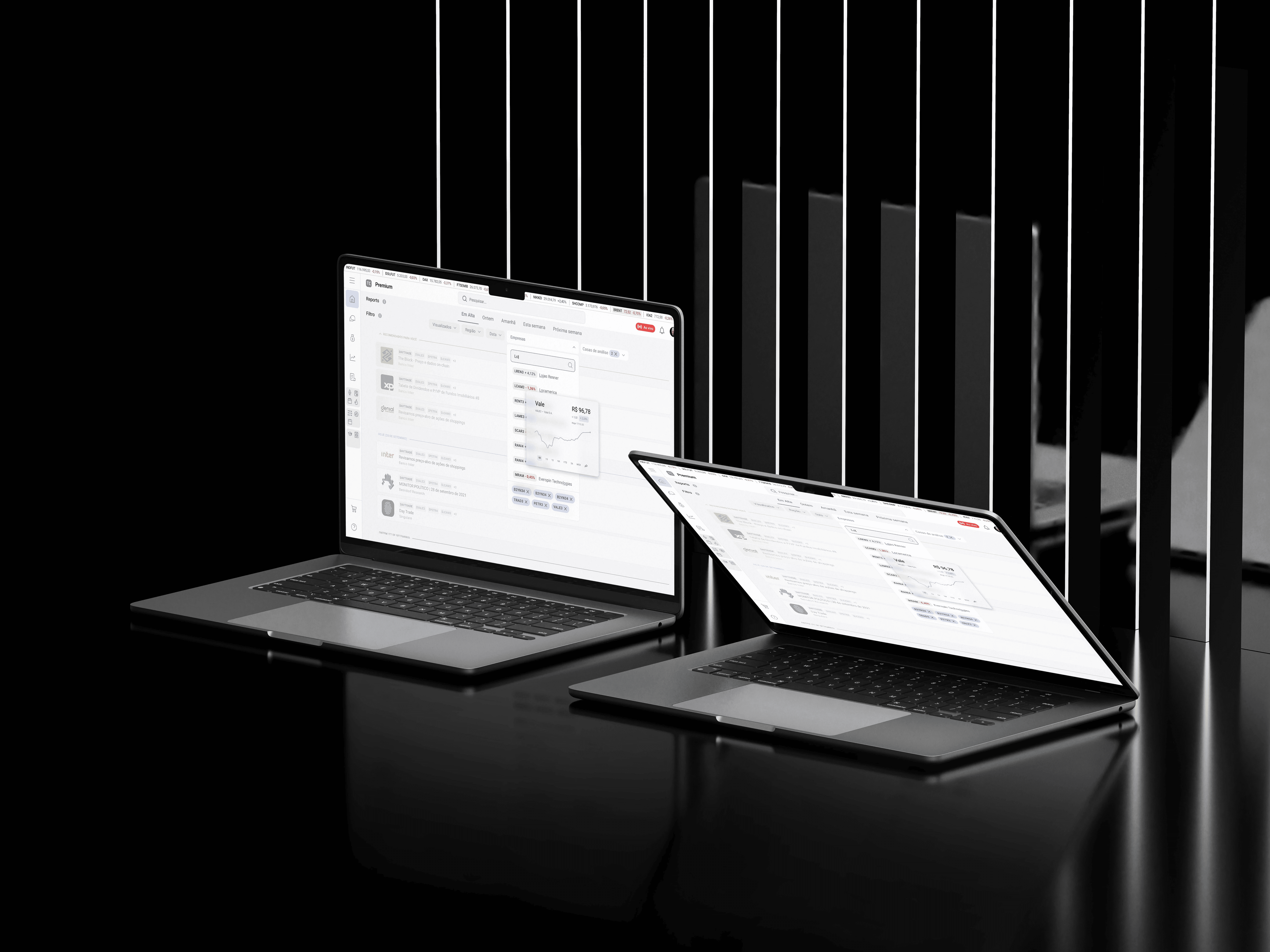
Desktop and mobile. The filter system went from audit to production, bringing structured discovery to one of TC's most-visited sections. The filter island pattern was subsequently adopted across other areas of the platform as a standard interaction model.


